Showing posts with label Clearly Besotted. Show all posts

Friday, 28 August 2015

Under The Sea

I recently treated myself to some lovely Clearly Besotted stamps, including the fun "Under The Sea" set, so I went about creating a couple of cards with a real underwater feel to them.


I started with a square of white card which I coloured by smooshing Tumbled Glass, Evergreen Bough and Scattered Straw Distress Inks onto an ink blending mat and spraying with a fine mist of water before dragging the card through the ink. I found that the card I was using tended to buckle when it was really wet with all the ink, so I decided to accentuate this by making several rough creased folds in the blue part of the card to represent waves. I distressed the edges of my panel and I then added some more Blue and Green Ink to my blending mat and dragged the folded parts and distressed edges through again until they were a shade darker. Finally I dried my panel thoroughly using my heat gun, before I stuck it to a 5" square white card blank.

The cute whale and starfish were stamped onto smooth white card using Memento Tuxedo Black dye ink and then coloured with Copic Ciao Markers. I used a Copic blending pen to add some lighter highlights and then fussy cut them and added them to the card with foam pads. A small amount of Glossy Accents was used over the eyes and for the whale's water spout. Both sentiments were stamped directly onto the card.

I wanted to add some beach embellishments to add texture and interest and I knew that I had just the thing! A couple of years ago I discovered a wonderful range of tiny pots of sea themed treasures made by a company called Mudd Puddles. I bought mine online from The Carolina Stamper at Hilton Head Island, South Carolina, but I understand that the owner has since retired and closed the shop, so now I need to find another supplier for when I have used up my ten little jars of beacheyness (is that even a word?)! Anyway I added a layer of "Malibu Beach" (actual golden sand suspended in a sticky medium) to the bottom of my card panel with a palette knife. When this was dry I added some "Mini Shells", "Beach Mini Pieces", "Beach Glass" and "Sea Glass" (all miniature sized real beach ephemera suspended in an adhesive medium). I absolutely loved the effect so I'm sure that you'll be seeing me using more in future!


In fact I liked it so much that I made a second card (above) - almost identical, except that the Distress Inked background has slightly more of a sandy pattern to it.

Thanks for looking,

Lynn

Thursday, 27 August 2015

You're Sew Special.

Hello again! I'm sorry about the sporadic blogging, but my daughter Jessica is at home for the summer and I have been enjoying some family time before she goes back to University in Kent. 

I have recently made a couple of cards though - this time using the lovely "Sew Special" stamps from Clearly Besotted. 

I started by making a patchwork panel for the background, using several different colours of Core'dinations card stock from the Whitewash collection which I die cut with Papertrey Ink's "Happy Hexagons" coverplate, then embossed with a variety of embossing folders, before sanding. If you're interested you can see how I did this by referring to my earlier post here: http://thehardystamper.blogspot.co.uk/2013/11/coordinations-hard-core-crop-challenges.html 


The sentiment was stamped onto a Stitched Fishtail Flag (cut with a Die-namics die) using Memento Teal Zeal dye ink. I also used the same ink and card to stamp the dress form and tape measure, which I then fussy cut and added with foam pads. The buttons, needle and cotton reel were cut from scraps of Core'dinations card using Spellbinders dies and a little bakers twine and a charm were all I needed to finish off. 

The photo below is a close - up showing the details and texture. I love that cute little Clearly Besotted tape measure stamp!


My second card was made the same way, but in different colours and with a slightly different sentiment.


Again the close - up below shows much more detail. These are really tactile cards in real life - I wish you could all stroke them!


The first card has already made it's way to it's new home with a friend in Surrey and I think that the second one is still en route to another friend in the USA. Thanks for looking.

Lynn

Saturday, 29 November 2014

Text Me!

I treated myself to a set of the Clearly Besotted Text Me stamps recently as I thought they would be ideal for making cards for young people and would be suitable for male cards too. I needed a couple of birthday cards so I made a batch of six cards, using C6 black card blanks and a variety of Spellbinders and Cuttlebug embossing folders for the yellow backgrounds. 


I stamped the phone and headphones onto black card with Versamark ink and heat embossed them using clear embossing powder. There are actually a matching set of dies for these stamps, but since I don't have them yet I fussy cut everything out by hand. I put some double sided tape onto the back of the stamped headphones before I cut them out, which made it much easier to stick them to the cards afterwards! I used Memento Tuxedo Black dye ink to stamp the various text messages and icons onto lemon yellow card, cut them out and stuck them to the phones with strong double sided tape. The phones were then added to the cards with foam pads for dimension.  


Below you can see all six of my cards, with their different embossed backgrounds. As usual you can click on any of the photos to get a clearer view.


I am really pleased with the finished results, even though the headphones took me ages to cut out! Each card also has a white insert inside, for ease of use. 

I am entering one of these cards into the Simon Says Stamp Wednesday challenge - you can find all the details here . 

Thanks for looking,

Lynn.

Saturday, 8 November 2014

An Aviation Birthday

Today our eldest grandson Max has his third birthday, so I needed to make him a special card. He is fascinated by all sorts of aircraft and is very knowledgeable for such a tender age. I was admonished by him when I showed him a photo of a helicopter in one of his books - "it's not a helicopter Grandma - it's a Sea King"! Similarly he can tell a Spitfire from a Hurricane etc, whereas I just see a 'plane! We think he might end up being a pilot when he grows up.

So clearly an aircraft card was called for and Clearly Besotted's Take Flight stamps and matching dies were just perfect for the job.


I used a 6" square white card blank and layered some Core'dinations card from the Tim Holtz Kraft Core Nostalgic collection. This was topped with some pretty cloud patterned paper from the "Up, Up & Away" NitWit collection by Lili of the Valley. The letters were cut from the Core'dinations card using the Memory Box Classic Alphabet Upper Case dies and adhered to the card with a dab of Ranger's Studio multi-medium matte.

The aircraft, banners and sentiments were stamped onto smooth white card with Memento dye inks (Love Letter, Tuxedo Black, Tangelo, Dandelion and London Fog). I tried to match the aircraft colours to some of the characters from Disney's Planes (Blade Ranger, Dusty and Leadbottom) as Max is very fond of those too. The coordinating Take Flight dies made it really easy to cut everything out and there is even a little separate stamp for the banner strings, which I stamped directly onto the patterned paper. Everything was stuck onto the card with double sided tape and clear foam pads in selected areas, to add dimension and make it look like the planes were banking round.

I was really pleased with how this turned out and I hope that little Max liked it too.


Here is the birthday boy, modelling the cute aviator hat that his Auntie Jess bought him for his birthday.


We bought Max the matching aviator jacket to match and he looked so cute in his new outfit. Here he is with his Daddy trying to salute. I love the photo below - he looks so pleased with himself!


Thanks for looking.

Lynn

Monday, 6 October 2014

Cupcakes galore and Happy Stampers at Port Sunlight.

I was lucky enough to be able to go to the Happy Stampers show at Port Sunlight on Saturday. I was really excited as I hadn't been to a show for ages and was missing seeing all my friends. An added bonus was the fact that Waltzingmouse Stamps were exhibiting there for the first time and I was looking forward to meeting the owner, Claire Brennan. I was also thrilled that my good friend Penny was able to attend for the first time, as she had recently moved up to the north west from the south coast and I hadn't seen her for about four years. Apologies for the large number of photos in this post, but I have lots to show you!

The day before (and inspired by the Great British Bake Off), I decided to make some cakes to take with me as gifts. I started by making a batch of carrot and walnut cakes with cream cheese frosting.


Then I made a big batch of toffee and date cupcakes, which were topped with buttercream, chocolate crunchies and Thornton's fudge.


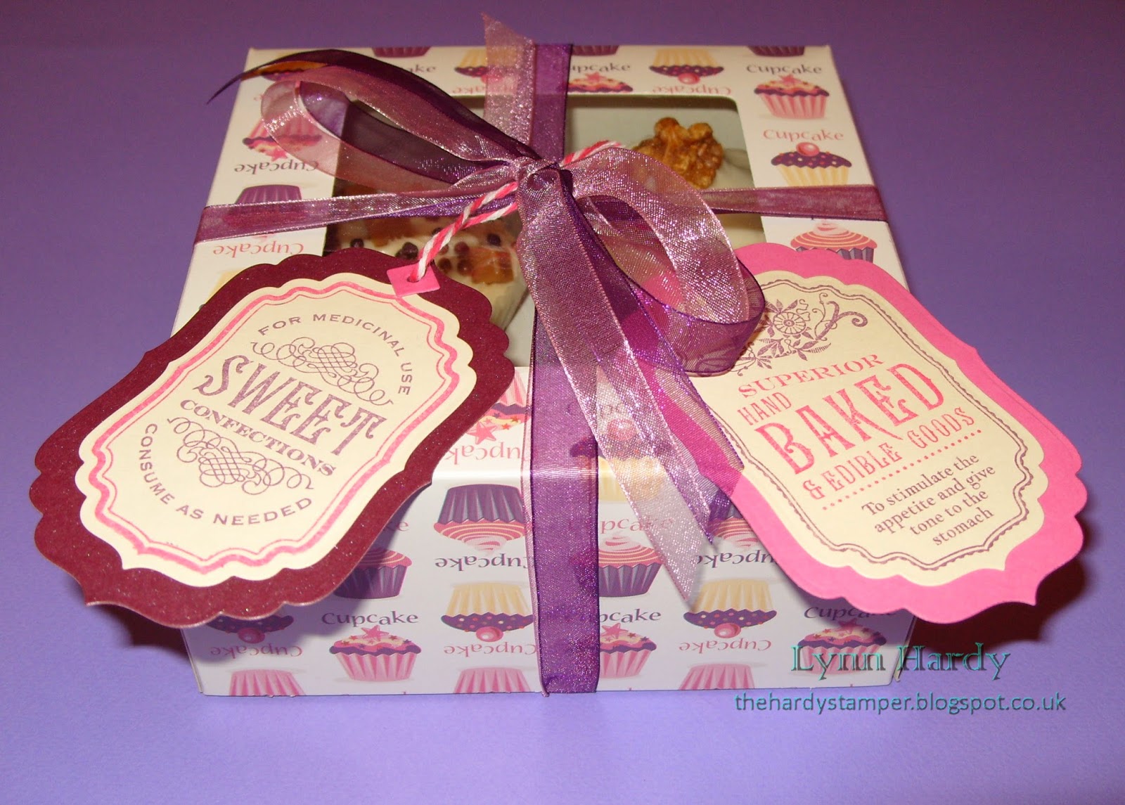
I packed a tin full of cakes to give to the lovely ladies of the Happy Stampers club, in appreciation of all their hard work (as volunteers) in organising the show at Port Sunlight twice a year. The labels were made with Waltzingmouse stamps from the Rescue Remedies set stamped with Memento dye inks and cut with Spellbinders Labels Four dies.


The photo below shows the reverse of the labels. I used Waltzingmouse Stamps - Country Labels 4, a sentiment from Tag Collection 1, the smallest cupcake from Frame It and the question from the Eat Cake set. The tops of the tags were completed with the addition of pairs of tiny grommets cut from the folding tag die set by Waltzingmouse Cutting Edge Dies. My lovely personalised tree stamp was a birthday gift from my daughter Jessica and was made by My Rubber Stamp in Texas, USA.


I had bought some pretty cake boxes from Morrisons supermarket. Each held four cakes and I tied them up with plum and pink organza ribbon and made the co-ordinating tags as above.


I hardly slept that night, but I was up bright and early to set off to Port Sunlight. I travelled by tram and bus to Manchester then a train to Liverpool, followed by a second train to the pretty village of Port Sunlight. Even the railway station below looked pretty!


The village of Port Sunlight was built by the philanthropist William Hesketh Lever (later Viscount Leverhulme) at the end of the 19th century in order to house workers from the nearby Lever Brothers soap factory (now the global company Unilever). Over thirty architects were employed to build the model village, resulting in buildings that were both beautiful and unique. The half timbered building below is used as the local tea rooms and is directly opposite the railway station.


The red brick building below has an unusual octagonal shaped tower and is situated to the far end of the road at the right of the photo above. 


Opposite, this lovely building has plenty of character, with leaded windows and black pebbles inset in rendered panels between the stonework. The surrounding hydrangeas looked beautiful too. 


This row of half timbered houses leads down towards Bolton Road, where Hulme Hall (the historical venue for the stamping show) is located. Unfortunately in my excitement to meet up with Penny and go inside I forgot to take any photos of Hulme Hall itself.


Once inside I distributed cupcakes to the Happy Stampers, a box to Jill and Sarah at The Stamp Man and a box to Claire and Sandie at Waltzingmouse Stamps. Now I had room in my bag to shop!


The photo below is of the lovely Claire from Waltzingmouse stamps and myself, which Penny kindly took for me. (This one is especially for you Jeanne)! Then I put my camera away and promptly forgot all about taking any more photos as we were so busy catching up, chatting and of course shopping!


I had the best time ever and really enjoyed the company, talking stamping all day and acquiring lots of new and interesting products to add to my stash! All the artwork samples were outstanding and there were plenty of demos to watch too. We loved what Sarah Anderson was doing with the Frantage kits at The Stamp Man and Penny and I bought a set each so that we can try it at home ourselves.

The rest of the photos below show my crafty haul from the show (there are quite a few of them, but please don't tell my husband)! First we have four packs of A4 pearlescent card, an 8" square Christmas paper collection, Graphic 45's 12" Twelve days of Christmas paper pad (at a bargain price) and four of the gorgeous Lili of the Valley NitWit collection pads.


These are the dies (Lawn Fawn, Impression Obsession and Spellbinders), alphabet stencil (Tim Holtz) and tree skyline mask (Clarity) that I bought. 


Below are a set of transport stamps and matching dies from Clearly Besotted - our eldest Grandson will love these as he is fascinated by planes and helicopters. The pack of ribbons was a freebie form Clearly Besotted too. On the right are the Zigzag background and Splat That stamps which I bought from Waltzingmouse. Claire added a lolly and some love hearts to my bag - you've got to love free sweeties!


Those of you who know me well will also know that I love Waltzingmouse stamps very much - so you may be thinking that I was very restrained in only buying two stamps from there. However, you would be wrong, as I have to confess to placing an order for the new releases just last Sunday and they arrived on Tuesday - see below! 


Other stamping purchases included the new Merry Christmas stamp and Chocolate gilding flakes from Kay at Indigo Blu, a JustRite Butterfly vines background stamp which I had been coveting since it was released and a very large and deeply textured Impression Obsession seashell and starfish background stamp. 


Our next visit was to Lavinia stamps where I bought two packs of SceneScapes background cards and two very detailed stamps. I can't wait to use the tree branch stamp together with the new squirrel dies for an autumnal card!


We both bought a spray to assist with die cutting intricate shapes (I hope it works). I also got a new Archival inkpad, a Gelatos set (reduced) and the Frantage encrusted jewel kit that I mentioned earlier.


Finally, I visited Paper Artsy just before the show closed and added to my collection of Fresco paints and Treasure Gold waxes - Spanish Topaz (top), White Fire (middle) and limited edition Lilac (bottom). The stamp and swivel clip were freebies from Mark and Leandra :) 


I suspect that I shall be on a stash ban for the foreseeable future, but I have plenty of new goodies to play work with and I am inspired to start creating again as soon as possible. If you have managed to read this far - thank you very much! 

Lynn

Sunday, 22 June 2014

Cure For The Monday Blues Challenge # 21 - Placing Pizzazz

I have been feeling in a floral mood today - probably because we have some gorgeous blooms out in our back garden at the moment. I'm not sure exactly what these purple flowers are, but they have very dark centres and pretty frilly leaves and are looking particularly lovely this year.


We built an arbour last year and planted some honeysuckle at the back, which we took as a cutting from my Dad's original plant. We bought a pair of red climbing roses to train up the trellis each side - we chose these as my Dad used to love roses and David's Mum used to love red flowers, so we thought it would be a nice way of remembering them both. This year they are doing really well and have produced some stunning velvety red blooms, so I couldn't resist taking some photos to share.


This week Taheerah has chosen an inspiration photo which also has bright flowers, http://littlemisst-papercraft.blogspot.com/2014/06/cure-for-monday-blues-challenge-21.html , so I decided to focus on those and design a more Clean and Simple card. Those of you who know me will realise that I don't usually do CAS - I am always too tempted to keep adding layers and embellishments - so I think I've been much more restrained for once - Lol!
 

Source: Pinterest
 
 
I decided to concentrate on the three blooms in the inspiration photo above, so I selected the pretty peony stamp from JustRite's "Seeds of Summer" clear stamp set (CR - 03755) and started by stamping it onto some Friskett masking paper and cutting it out carefully to make a mask. Working directly onto a white DL card blank I then stamped a vertical row of three of the peonies using Watering Can Archival Ink and my mask. I used Tim Holtz Distress Markers in bundled sage, festive berries, mustard seed and spun sugar to scribble some ink onto an acrylic block, then I picked this up with a fine detail tipped waterbrush to watercolour the flowers. As I hadn't used watercolour paper the card warped a little, so when it was dry I found my iron and actually ironed it smooth again!
 
 
Please click on the photo for a better view.
 
 
The Thank You sentiment is from Clearly Besotted's "Many Thanks" clear stamp set and was stamped with Tuxedo Black Memento Dye ink. I used foam tape to adhere the sentiment to a banner which I made by stamping the polka dot background from the "Gingham & Co" clear stamp set by Waltzingmouse Stamps with Rose Bud Memento Dye ink and trimming into a banner shape. At this point I had to sit on my hands to stop myself from adding anything else!
 
So I have probably shocked you three times today - with a CAS design, doing some ironing, and (very unusually for me) completing and blogging a card several hours before the actual challenge deadline! I think I'd better go and lie down in a darkened room!

Thursday, 29 May 2014

Stamped Emboss Resist and Watercolour Wash

I have four cards to show you today, all using the third technique taught in the recent online watercolour for card makers classes. All stamped background images were stamped with Versamark ink and heat embossed using Wow! Opaque Bright White Super Fine embossing powder. I then used my Winsor and Newton Cotman watercolour paint set to add a watercolour wash over each background. The white embossing acted as a resist and gave a lovely result.


For my first  card I stamped the Big Bold Background Belle Flowers by Chocolate Baroque (USQSP0407) onto Bockingford Watercolour paper and heat embossed. I used three colours of paint for the watercolour wash, which I did using a wet on wet technique. I layered the panel onto orange and blue card and a 6" square scalloped card blank. The Birthday die cut and wishes stamp are by Papertrey Ink and I added faux stitching with a Hot Off The Press stamp over the velum and orange card strip. Finally I embellished with a few sequins, which I stuck on with Ranger's Studio matte multi-medium.


My second card was made in much the same way, but this time using the largest stamp from Wendy Vecchi's Art Colors Life set (LCS053). I chose Purple Lake, blue and Viridian green paints for the watercolour wash and used Bockingford watercolour paper again. The "Happy" stamp is from Clearly Besotted's "Happy Everything" stamp set and the Birthday die cut is by Papertrey Ink. I also used sequins to embellish this one.
 
Please click on each photo for a better view.
 
For my third card I used the beautiful background stamp from Joanna Sheen's Tales of the Ocean - Fossil stamp set (JS317). Using Bockingford watercolour paper again I painted with a selection of coral, grey, yellow ochre and beige coloured paints, but this time I tried to keep within the shapes of each fossil, rather than blending the colours too much. The panel was mounted onto coral coloured card and a mottled beige C6 card blank. The sentiment stamp and die are from Clearly Besotted's Mini Basic Banners set and I used Memento London Fog ink. Once again I embellished my card with a few sequins (these came from Abakhan).


My last card is a lager 8" square one. This time I used smooth white card as I wanted to capture the detail from the lovely Big Bold Background Leafy Trails stamp by Chocolate Baroque (USQSP0406). For my wet on wet watercolour wash I chose Lemon Yellow, Sap Green and Viridian Hue paints and blended them together where they met. I used the same stamp and Memento Pear Tart ink to stamp the white card blank, layered the panel onto green card and added a die cut and stamped sentiment (from Papertrey Ink). Finally I embellished with two different sizes of pearls, which I placed where each berry was on the stamped image. I was really pleased with how this turned out - it looks so fresh in real life!

Thursday, 22 May 2014

Soft Watercolour Wash Background (with Stencils) - part 2


My next card using the watercolour and stencil technique is a softer colour palette of blues, lavenders and lilacs. I chose The Crafters Workshop Mini Cubist stencil and the result reminds me a little of the works of Gustav Klimt - what do you think?

Please click on the photo for a better view.

I found the die cut banner in my stash (I think it's a Sizzix one). The sentiment is from the "Many Thanks" set by Clearly Besotted and I curved it slightly on my acrylic block, so that it fitted nicely onto the banner. I heat embossed the sentiment with Wow! Opaque Pastel Purple and mounted the banner to my card with foam pads. Finally I embellished the card with a few tiny blue and lilac gems. I was really pleased with how this one turned out and would definitely recommend using this particular stencil for this technique.

I'll be back shortly with the next card in this series.