Showing posts with label Bockingford Watercolour paper. Show all posts

Friday, 3 August 2018

Watercolour animal quartet cards

Hello and welcome! Today I'm sharing some more cards made with watercolour paintings which I did as part of the Simply Watercolor Online card class. Kristina Werner's example was a painting of a dog, cat, fox and tiger but I had lots of ideas for different quartets of animals and I came up with the following three cards.


My first card has two cats and two dogs and they all seem to be getting along just fine! For all three cards I started with a 6" square panel of Bockingford cold pressed watercolour paper and used my Winsor & Newton Cotman watercolour paint pans and white gouache paint.


  My second card features a hippo, a bird and a pair of sheep and I added a handwritten sentiment which reads "Hippo Birdie 2 You"! Fun right?


Finally I went with a woodland theme and painted a badger, fox, owl and a rabbit (at least that's what I intended, but I think that my rabbit looks a little mouse like). Obviously I need to practise a bit more!

Thanks for looking.

Thursday, 4 February 2016

Watercolour Pears

Hello, I am back for my second post of the day to share another watercoloured card which I have painted as part of one of the lessons in the Online Watercolour for Cardmakers - Intermediate Techniques Course.


I used Bockingford 140lb Cold Pressed watercolour paper to make a 5" x 7" card blank and painted my pears using Quinacridone Gold, Permanent Sap Green, Alizarin Crimson and Olive Green paints from Winsor & Newton's Professional Watercolour range.


The teacher, Dawn Woleslagle, used the inside of a Wplus9 die to draw her rows of pears. However I don't own those dies, so I made a stencil by stamping an image of a pear onto thickish card and cutting out the centre. A wet on wet technique was used to paint the pears, enabling the colours to merge together in a variety of ways. The stems and leaves were painted in freehand.

Again I decided not to add a sentiment to my card - but I can always add one at a later date if needed. I am really pleased with how this turned out. The colours are a little more delicate than they were for my previous apple card and I love the subtle look that this gives.

Thanks for looking,

Lynn

Watercolor Apples

Hello, today I am sharing a watercoloured card which I have painted as part of one of the lessons in the Online Watercolour for Cardmakers - Intermediate Techniques Course.


I used Bockingford 140lb Cold Pressed watercolour paper to make a 5" x 7" card blank and painted my apples using Quinacridone Gold, Permanent Sap Green and Alizarin Crimson paints from Winsor & Newton's Professional Watercolour range.


The teacher, Dawn Woleslagle, used the inside of a Wplus9 die to draw her rows of fruit (she painted pears). However I don't own those dies, so I made a stencil by stamping an apple image onto thickish card and cutting out the centre. A wet on wet technique was used to paint the apples, enabling the colours to merge together in a variety of ways. The stems and leaves were painted in freehand.

I decided not to add a sentiment to my card just yet - but I can always add one at a later date when I need a card in a rush. I am really pleased with how this turned out for my first attempt at this technique!

Thanks for visiting. I'll be back shortly with another similar card to show you.

Tuesday, 2 February 2016

Colour Mixing Wheel

Welcome back to my third post today! Here I am sharing the results of a colour mixing exercise which I've done as part of the current Watercolour Online Card Class.


I transferred the colour wheel chart onto Bockingford 140lb Cold Pressed watercolour paper using pencil and black Faber Castell Pitt Artist pens. The India ink in these pens is waterproof and is therefore perfect for painting without the ink bleeding. Once again I chose to use Winsor and Newton Professional grade watercolour paints in three Primary colours - Rose Madder, Aureolin and Cobalt Blue (see the largest circles on the chart below). These colours were then mixed in pairs,  in equal proportions, to obtain the secondary colours (indicated by the medium sized circles on the chart below). Further mixing of the primary and secondary colours yielded the six tertiary colours (as shown in the smallest circles below).The central brown colour is a combination of all three primary colours.


Finally I tried mixing complimentary colours together (opposite each other on the colour wheel) to achieve neutral tones of browns and greys. Again it was fascinating to see how my own paints reacted and the wide range of colours that were achievable.

Thanks for looking and I hope that I've inspired you to get out your paints and try this yourself.

Watercolour Glazing Chart

Hello! This is my second post today regarding Watercolour painting exercises for the current Online Card Class.
This post focuses on the (new to me) technique of paint glazing. I chose to use Winsor and Newton Professional grade watercolour paints for this exercise, due to their translucent nature. I started by transferring the glazing chart supplied onto Bockingford 140 lb Cold Pressed watercolour paper using pencil and black Faber Castell Pitt Artist pens. The India ink in these pens is waterproof and therefore ideal for painting without the ink bleeding. The entire chart was painted using only three Primary colours - Rose Madder, Aureolin and Cobalt Blue. I started by painting two vertical columns red, two yellow and two blue. When these were fully dry I over painted the second column of each colour with one of the other primary colours as indicated. This produced three secondary colours as shown below.


I made sure that the paint was all thoroughly dry before proceeding to paint the horizontal stripes in the same manner. You can see the finished glazing chart below. All the variations in colour were achieved by layering just the three primary colours in different combinations. I found this a really interesting exercise to see what a wide range of colours could be made from using only red, yellow and blue. Of course, different shades of these three colours, together with various ratios of paint to water, would yield infinite combinations of colours - I can't wait to experiment some more!


Thanks for looking,

Lynn

Watercolour Paint Swatches

Hello and a very belated Happy New Year to you all! Sorry for my lack of blogging recently - I have actually made several cards but haven't had time to show them on my blog yet.

I am currently participating in a fabulous Online Card Class, Watercolour for card makers - Intermediate Techniques.This was part of my Christmas gift from my lovely husband, who also bought me a beautiful set of 36 Japanese Gansai Tambi watercolour paints, a colouring book and some die storage drawers - I'm so lucky!


The teacher, Dawn Woleslage (of Wplus9 fame), set a series of Pre-Class exercises to help us to familiarise ourselves with the properties of our own particular paints. First of all we were advised to make paint swatches of all of our watercolour paints, to enable us to better assess their individual qualities. I painstakingly transferred the swatch charts onto Bockingford 140lb Cold Press watercolour paper using pencil and Black Faber Castel Pitt artist pens (waterproof India Ink). The thick black line within each rectangle is used to establish whether the colours are Transparent, Semi - Transparent or Opaque. One coat of each colour paint was applied to the whole area, then a second coat was added only to the right side of each rectangle to show how the colours become deeper with a second layer of paint.


My first swatch chart shows my new Japanese Gansai Tambi paints from Kuretake. They are deeply pigmented and I love the vibrant colours! As an added bonus there are three metallic paints included too.


My second swatch chart was painted using my set of 24 Winsor and Newton Cotman pan paints - also a gift from my husband several years ago. This is my trusty set, which I used to paint landscapes etc when I attended evening classes a couple of years ago. The Cotman range are student grade watercolours which tend to be not so translucent, due to the quantity of binders used during production.


Out of curiosity I purchased a few tubes of Winsor and Newton's Professional watercolour paints to see how they compared to my student grade Cotman set. My third swatch chart below shows these, although I only have 14 colours at the moment. I deliberately left spaces on my chart to include future purchases when I can add to my collection (although there are actually 96 colours in the range, so this may take a while)! The difference in quality was immediately noticeable, with the paints having a more delicate feel to them due to their translucent properties. This makes them much more suitable for techniques such as glazing, where paint is layered. I am looking forward to becoming more familiar with these paints, which I think will be ideal for botanical type paintings.


Thank you for reading this far and I shall be back soon with some completed colour mixing exercises.

Lynn

Wednesday, 26 November 2014

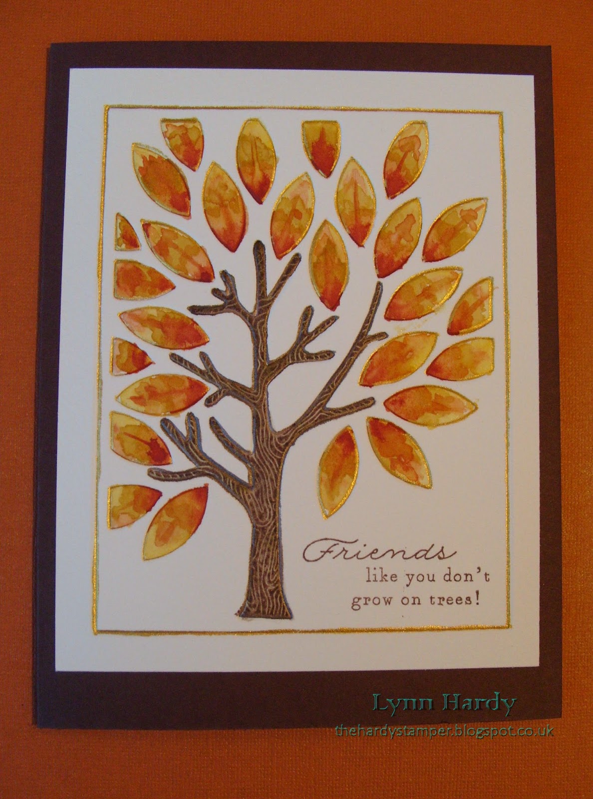
Cure For The Monday Blues Challenge # 35 - Leaves an Impression.

Today I am joining in with Taheerah's Cure for the Monday Blues Challenge #35. You can find all the details on her blog here . This week the inspiration photo shows a dining room with a delightful chandelier bedecked with falling autumn leaves, so I took the leaves as the starting point for my card.


I started by embossing the Papertrey Mighty Oak coverplate onto some Bockingford Watercolour paper. Then I took a very fine paintbrush and painted all the outlines with Rich Cocoa and Solar Gold Twinkling H20 paints. When this had dried I used my regular watercolour paints to colour the tree trunk and autumn leaves, varying the colours of the leaves as I went. The tree trunk was then overstamped with the corresponding stamp from the Mighty Oak stamp set (this is such a lovely set and I'm sure I will be using it lots more in the future too). The sentiment (from the same stamp set) was added with Rich Cocoa Memento dye ink. The entire panel was then simply added to a Dark Chocolate card blank with lots of strong double sided tape to prevent warping.

Please click on the photo above for a larger view. 

I am thrilled with how this card turned out! It's certainly unique and an added bonus was that it was flat for posting. It has already been sent off to a dear friend in the USA - I hope that they like it too!

Thanks for looking,

Lynn.

Saturday, 15 November 2014

Runway Inspired Challenge # 71 - In Memory of Oscar de la Renta (part 2)

This is my second post today and is the second part of my entry for the Runway Inspired Challenge in memory of the designer Oscar de la Renta who died recently. You can find all the details on the Runway Inspired Challenge blog here .


I chose the photo below as my inspiration,  as did Taheerah - *Fill Your Paper With The Breathings of Your {Heart}*.


I used the same Wendy Vecchi stamp from the Art Colors Life stamp set as previously, together with the same three Distress ink markers (Mowed Lawn, Fired Brick and Squeezed Lemonade). However this time I coloured the stamp with the markers then spritzed it with a fine mist of water before stamping it onto some Bockingford Watercolour paper. This gave a lovely mottled look to my background, which I then layered onto a panel of green card and a 6" square white card blank. 


The photo below shows the background stamping, which looked really pale and pretty.


I then repeated the process, but this time I wet the Watercolour paper before stamping, which gave a really mottled look. I thought that the green looked a little like the branches of a Christmas tree with red and yellow lights on it, so I used this paper to cut out two tree shapes using Dee's Distinctively Christmas Tree Silhouette and Christmas Tree No 3 dies.


Using a damp paintbrush I added a little more distress ink in places where it was pale, until I had a more even coverage. Here you can see the two trees before I layered them onto my card using clear foam tape for dimension.


Again I stamped the sentiment, from Waltzingmouse Stamps Vintage Ornaments set in Memento Tuxedo Black dye ink and my card was complete. Two totally different cards using the same stamps and inks, but different techniques! I think that this watercoloured one is my favourite of the two. I hope you like them. Thanks for looking.

Lynn

Thursday, 29 May 2014

Stamped Emboss Resist and Watercolour Wash

I have four cards to show you today, all using the third technique taught in the recent online watercolour for card makers classes. All stamped background images were stamped with Versamark ink and heat embossed using Wow! Opaque Bright White Super Fine embossing powder. I then used my Winsor and Newton Cotman watercolour paint set to add a watercolour wash over each background. The white embossing acted as a resist and gave a lovely result.


For my first  card I stamped the Big Bold Background Belle Flowers by Chocolate Baroque (USQSP0407) onto Bockingford Watercolour paper and heat embossed. I used three colours of paint for the watercolour wash, which I did using a wet on wet technique. I layered the panel onto orange and blue card and a 6" square scalloped card blank. The Birthday die cut and wishes stamp are by Papertrey Ink and I added faux stitching with a Hot Off The Press stamp over the velum and orange card strip. Finally I embellished with a few sequins, which I stuck on with Ranger's Studio matte multi-medium.


My second card was made in much the same way, but this time using the largest stamp from Wendy Vecchi's Art Colors Life set (LCS053). I chose Purple Lake, blue and Viridian green paints for the watercolour wash and used Bockingford watercolour paper again. The "Happy" stamp is from Clearly Besotted's "Happy Everything" stamp set and the Birthday die cut is by Papertrey Ink. I also used sequins to embellish this one.
 
Please click on each photo for a better view.
 
For my third card I used the beautiful background stamp from Joanna Sheen's Tales of the Ocean - Fossil stamp set (JS317). Using Bockingford watercolour paper again I painted with a selection of coral, grey, yellow ochre and beige coloured paints, but this time I tried to keep within the shapes of each fossil, rather than blending the colours too much. The panel was mounted onto coral coloured card and a mottled beige C6 card blank. The sentiment stamp and die are from Clearly Besotted's Mini Basic Banners set and I used Memento London Fog ink. Once again I embellished my card with a few sequins (these came from Abakhan).


My last card is a lager 8" square one. This time I used smooth white card as I wanted to capture the detail from the lovely Big Bold Background Leafy Trails stamp by Chocolate Baroque (USQSP0406). For my wet on wet watercolour wash I chose Lemon Yellow, Sap Green and Viridian Hue paints and blended them together where they met. I used the same stamp and Memento Pear Tart ink to stamp the white card blank, layered the panel onto green card and added a die cut and stamped sentiment (from Papertrey Ink). Finally I embellished with two different sizes of pearls, which I placed where each berry was on the stamped image. I was really pleased with how this turned out - it looks so fresh in real life!